

Time Capsule
(Application)
This group project focused on designing an application that enables users to create and upload memory capsules, offering an organized and nostalgic experience when revisited or shared.
About
Role
UI Design
UX Research
Team
Tessa Cervantes Roth
Wiktor Wdowiak
Ahlam Adam
Client
S&box
Time
12 weeks
Problem
Users often feel uncertain or vulnerable when documenting or revisiting personal memories. Most digital memory-keeping tools fall short in providing thoughtful guidance or intentional opportunities for reflection leaving users feeling disengaged.
Today, users are increasingly seeking deeper, more meaningful ways to process and make sense of their lives. However, existing storytelling and journaling platforms tend to prioritize the act of capturing over the experience of reflecting. As a result, they overlook the needs of users who value preserving and revisiting memories.
Key insight:
"Users often don’t know where to start or how to organize their memories and once saved, those moments are rarely revisited."
Solution
Designing a memory-sharing app that empowers users to privately capture, preserve, and revisit meaningful life moments with a strong focus on emotional connection and nostalgia. Our goal is to create a simple, intuitive, and emotionally resonant experience for young adults who feel preset by traditional social media.
Through user research and iterative design, we introduced features like time-locked memory capsules, multi-format support (photos, voice, text), and smart reminders tied to life events. The minimalist interface and guided onboarding ensured effortless memory keeping, while controlled sharing options gave users full autonomy over their content.
User research summary
To better understand the needs of our target audience, young adults aged 18 to 40, we conducted a survey with 15 participants.
Our goal was to explore what features users value most in memory-sharing platforms and to uncover pain points with existing applications.
The insights gathered revealed a consistent desire for a more meaningful and private way to capture memories one that contrasts with the fast-paced, performative nature of traditional social media. These findings informed the foundation of our design: creating a more intentional, emotionally resonant experience that supports reflection and nostalgia over noise and likes.
1
2

Using insights from our user survey, we developed personas that reflected the values, behaviors, and needs of our target audience. The analysis highlighted a common theme: while there are many memory-saving apps available, users felt that few truly prioritize emotional depth, customizability, and meaningful reflection. This insight helped us focus on designing a more intentional, personal experience tailored to users seeking a quieter, more private space for their memories.


Analysis
Ideation
Guided by our “How Might We” (HMW) questions, we categorized user feedback and began generating design concepts rooted in the needs and motivations of our target audience.
One key challenge we aimed to solve was user retention, how to encourage users to return to the app regularly. During a Crazy 8s brainstorming session, we identified sound, subtle animations, and personalized notifications as effective strategies to capture attention and create a more engaging experience. We expanded on these ideas through rapid sketching, which helped us visualize and iterate on potential solutions.


1
Private Memory Capsules Users can create personal, invitation-only memory capsules that serve as digital time capsules for moments they want to preserve.
2
Nostalgia-Driven Timelines A scrollable, visual timeline inspired by physical scrapbooks allows users to revisit past moments with an emphasis on cherishing memories rather than gathering likes or comments.
3
Sensory Enhancements (Sound + Animation) Inspired by Crazy 8s sketches, we added subtle animations and ambient sound cues that play as users revisit their memories.

Solutions


Iterations
Throughout the ideation phase, our design evolved significantly based on user feedback and iterative testing. Early feedback revealed that users felt overwhelmed by too many icons, struggled with selecting capsules due to their small size, and found the memory-unlocking experience unintuitive.
In response, we refined the interface by simplifying the icon set to reduce cognitive load, enlarging and spacing out the capsules for easier selection, and redesigning the memory flow to make it more intuitive and emotionally engaging. These changes were guided by usability testing and internal reviews, allowing us to surface key actions earlier and streamline the overall experience.
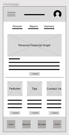
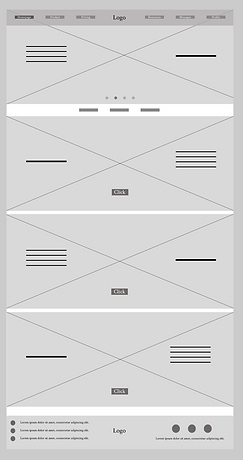
Digital Wireframes
I integrated my IA and paper wireframes into a digital wireframe. After many iterations, these wireframes best represented the user flow and user needs.
Large images, minimal text and call-to-action for more information.
A homepage where personal user information and company updates can be published instantly.
Accessible tabs to pages from navigation tab to footer of page.
Application
Website

After multiple rounds of iteration, feedback, and refinement, our final prototype brings the vision of a more meaningful, user-centered memory-sharing app to life. The core user flows creating a memory capsule, unlocking and revisiting moments, and receiving mindful prompts are now seamless, intuitive, and emotionally engaging. We focused on crafting a minimalist, distraction-free interface that emphasizes personal reflection and nostalgia over performance or social validation.
This version directly addresses the original problem: young adults feeling overwhelmed by performative platforms lacking emotional depth. By streamlining the onboarding process and simplifying navigation, users can now create their first memory capsule in under 10 minutes. Subtle animations, ambient sound, and a visual timeline all contribute to an experience designed to feel intentional, warm, and lasting.
Time Capsule Figma
Final Design
Design Style
We designed our interface using the iPhone 15 Pro frame, structured around an 8pt grid system and consistent 20px margins to ensure clean spacing and strong visual balance. This foundation allowed us to create a layout that feels open, intuitive, and easy to navigate across all screens.
The color palette is anchored in a warm latte brown, carefully selected to evoke a sense of comfort, nostalgia, and emotional depth core themes of our memory-sharing experience. UI components such as buttons, input fields, and memory cards were developed with modularity in mind, allowing for flexible and scalable design. For typography, we paired Cooper BT and SF Pro to balance personality with readability, reinforcing a cohesive and inviting visual identity across all touchpoints.


Throughout this project, we developed a stronger appreciation for designing with sentimental depth and clarity. One of the most eye-opening takeaways was how users responded to subtle details like color choices, animations, and sound that helped create a sense of connection and nostalgia. It became clear that thoughtful design evokes resonance and connection that transcend usability.
Accessibility consideration
1
Color Contrast: We ensured sufficient color contrast between text and background elements to meet WCAG 2.1 AA standards, making content readable for users with visual impairments or color blindness. We also avoided relying on color alone to convey information, using icons or labels as additional cues.
2
Clear visual feedback: To support users with motor or visual impairments, all animated elements included clear visual states (e.g., hover, focus, active) and avoided animations that might obscure important UI feedback. We also ensured focus is properly managed after media is uploaded, so users relying on keyboard navigation are not disoriented.
3
Motion sensitivity & Animation Controls: Animations were designed with accessibility in mind by avoiding excessive motion that could trigger vestibular disorders. We respected users’ system preferences for reduced motion by using the prefers-reduced-motion media query, allowing animations to be disabled or minimized when necessary.
1
Takeaways
Unexpected challenges included simplifying our original ideas. At first, the interface had too many features that overwhelmed users. Through testing and feedback, we learned the importance of refining the experience limiting icons, enhancing the capsule selection, and making the memory flow more intuitive. If we were to do it again, we’d begin testing even earlier to validate key decisions sooner.
Overall, this project helped us grow as designers sharpening our ability to adapt, listen, and prioritize what truly matters to users. Most importantly, it reminded us how powerful design can be when it creates space for reflection, emotional connection, and personal storytelling.
Next Steps
1
We plan to conduct usability testing with a diverse range of users to gather feedback and validate the accessibility and emotional impact of the experience.
2
Our next goal is to implement advanced media management features, such as tagging, searching, and smarter organization of memory capsules.
3
We aim to refine accessibility and optimize performance to ensure smooth media uploads and animations across all devices and user needs.