
The Flow
(Application)
This personal project was driven by a desire to analyze existing social media platforms and unify their most effective features into a single, cohesive experience. I designed an application that enables users to create and share written content, reels, and images all within one platform offering a streamlined, organized, and dependable experience for both revisiting and sharing content.

About
Role
Team
Client
Time
UI Design
UX Research
Tessa Cervantes Roth
The Flow
10 weeks
Problem
Users require a unified platform to share their work and ideas seamlessly but currently lack such an option. Additionally, they seek the ability to post extended text and stories without being constrained by character limits, enabling more comprehensive and unrestricted expression.
Solution
Develop a versatile platform that allows users to share diverse content types ranging from long-form stories and essays to multimedia creations without restrictions on character count, fostering creativity and collaboration in a single, user-friendly space.
User research summary
To gain a deeper understanding of our target audience, young adults and adults aged 18 to 50, I conducted a user survey with 10 participants. The insights revealed a strong desire for a community-oriented platform where users can engage in meaningful discussions and provide feedback on shared content.
Participants also expressed the need for a flexible space that supports both in-depth written posts and videos without restrictive limitations. Key findings included the demand for a unified platform, flexibility in content formats, and frustration with character limits commonly found on existing platforms.

Ideation
I organized user feedback into key themes and began developing design concepts grounded in the needs and motivations of the target audience. A central challenge was capturing and sustaining user attention in a crowded digital landscape. With numerous platforms competing for engagement, I focused on what would differentiate this app and encourage users to return regularly. User feedback highlighted the importance of timely notifications and design elements inspired by familiar platforms to create an intuitive and immersive experience. I explored these insights further through sketching and wireframing to establish a cohesive and user-friendly format.


1
Users Value Freedom from Text Limits: Participants consistently highlighted the freedom to write long-form content without character constraints as a major benefit. This flexibility encouraged deeper storytelling and more meaningful expression compared to other platforms with restrictive limits.
2
Navigation Could Be More Intuitive for New Users: While most users appreciated the range of content options available, new users initially struggled to understand where to begin when posting different content types. This revealed a need for clearer onboarding cues and more intuitive navigation between content formats.
3
Collaborative Features Foster Engagement, But Need Clearer Prompts: Test users responded positively to the ability to collaborate through comments and shared input. However, some were unaware of these features until prompted. Visibility and discoverability of collaboration tools were identified as key areas for improvement to enhance user interaction.


Solutions
Iterations
I refined the interface by simplifying the content upload process, introducing a dedicated submission screen to streamline navigation and enhance clarity across the platform. Additionally, I improved the interactivity and emotional resonance of key icons, making them more intuitive and engaging for users. These enhancements were informed by usability testing and internal reviews, which helped identify opportunities to surface key actions earlier and create a more seamless, user-centered experience.


Digital Wireframes
I integrated my IA and paper wireframes into a digital wireframe. After many iterations, these wireframes best represented the user flow and user needs.
Large images, minimal text and call-to-action for more information.
A homepage where personal user information and company updates can be published instantly.
Accessible tabs to pages from navigation tab to footer of page.
Application
Website

Following multiple rounds of iteration, user feedback, and refinement, the final prototype presents a cohesive all-in-one application. The core user flow enables users to write, capture, and share content within a single, intuitive platform. I focused on designing a minimalist, engaging, and distraction-free interface that encourages both personal expression and seamless content viewing.
This solution directly addresses the initial problem: users lacked a unified platform for sharing their work and ideas. By introducing a centralized navigation bar that consolidates all content creation options, the app simplifies the sharing process and fosters stronger user connections.
Final Design

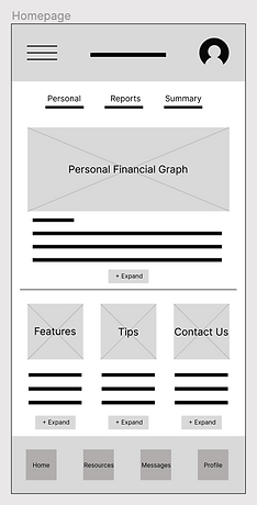
The Flow offers users streamlined access to all sections of the platform with the navigation bar while new content can be easily accessed via the central hub (homepage) or through the dedicated dashboard for written materials. This design enhances overall accessibility, allowing users to navigate efficiently to their desired content.
Accessibility consideration
1
Color Contrast: I ensured sufficient color contrast between text and background elements to meet WCAG 2.1 AA standards, making content readable for users with visual impairments or color blindness. I also avoided relying on color alone to convey information, using icons or labels as additional cues.
2
Clear visual feedback: To support users with motor or visual impairments, all animated elements included clear visual states (e.g., hover, focus, active) and avoided animations that might obscure important UI feedback. I also ensured focus is properly managed after media is uploaded, so users relying on keyboard navigation are not disoriented.
3
Motion sensitivity & Animation Controls: Animations were designed with accessibility in mind by avoiding excessive motion that could trigger vestibular disorders. I respected users’ system preferences for reduced motion by using the prefers-reduced-motion media query, allowing animations to be disabled or minimized when necessary.
1
Takeaways
Impact:
At the outset of this project, my goal was to create an all-in-one social platform that integrates various forms of interaction such as image posts, reels, stories, and messaging in order to foster meaningful user connections. Through in-depth research and iterative design, I continuously expanded my understanding of interactive design principles and gained valuable insights into the critical role user experience plays in shaping effective product decisions.
Key Learnings:
By analyzing both the strengths and pain points of competitor platforms, I identified what truly resonates with users. This informed the design of a responsive application that not only meets user expectations but encourages ongoing engagement.
Next Steps
1
Feedback: Seek UX/UI feedback from experienced designers to enhance the overall design and functionality.
2
Improvements: After feedback is given I will document improvements to make on the design.
3
Usability: Prioritize fixes and enhancements that address critical user issues and improve overall usability.